
Have you ever eaten from a dark blue dinner plate? Now imagine eating off those blue plates in a totally blue-painted room. Something’s off, right? That’s because the color blue is proven to have an appetite suppressing effect–this is the science and art of Color Theory. Research shows that our eyes and brains respond differently to different colors, so naturally there are many ways of playing with color to create the perfect ambiance.
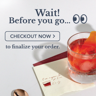
The wedding colors you choose set the stage for your event. They dictate everything from bridesmaids dresses to personalized wedding napkin colors. Answering "what wedding palette should I choose" can be a daunting decision! That’s where Color Theory comes in. Read on to find out how to delight your guests with stunning, science-backed color combos.

The Basics
We know, we know – this looks super complicated. We can already hear the cries of “art class?! I can’t even draw a stick figure!” all the way from our Chicago office. Fear not, color theory is actually very simple and organic. Color theory isn’t a strict rule or formula, but rather a set of ideas grounded in the psychology behind how we perceive colors.
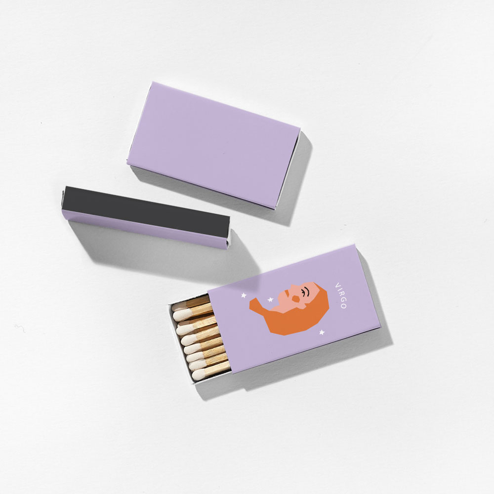
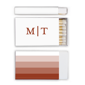
Let’s start from the ground up: the three basic color schemes you need to know are Monochromatic, Analogous, and Complementary. These names simply refer to where each color sits on the color wheel in relation to another. In the rightmost example below, we can see that red sits directly across from green–just like sweet and savory, red and green are complements! Opposites attract, right? Don’t take our word for it–just look at our gorgeous Perfectly Overboard suite rocking the blue/orange contrast as its wedding color combination. Going back to the food metaphors, you can visualize Analogous colors as a mixed fruit salad (like our Mod Mediterranean suite!), while Monochromatics are more of a berry blend (check out our Blushing Bride set). These two work well because they’re so similar, giving our eyes a sweet serving of visual harmony.

Advanced: Split Complementary
Congratulations, you have now graduated from level 1 of Color Theory class! As proven by our Complementary color schemes, the human eye loooves contrast. But, it also loves harmony…so how do we combine both? That’s where Split Complementary comes in. You can think of it as a Y shape on the color wheel: pick any base color, and then grab a few analogous complements across from it. Don’t worry, you’ll get the hang of it!
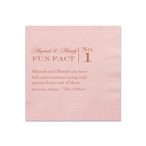
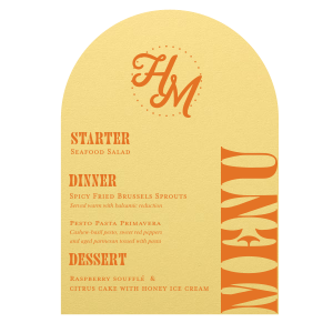
In most of our examples below, the base color is blue. Across from blue is orange and red, so these split complementary color schemes draw from shades of reds, pinks, oranges, and corals to form a more complex wedding color palette. Just remember, while you can explore any range of analogues, it’s important to stick to one single-shade base color in order to avoid visual confusion. For example, it might be a bit too much if we added violet napkins into our Hinterland Honeymoon suite, or bright green cups into Contemporary Indian wedding color palette. That being said, rules are for breaking–if you have your heart set on a rainbow of crazy colors, go for it! We won’t call the Color Cops.

Building a Palette from a Base Color
Bride brain is real. Let’s say you were possessed by a manic frenzy of wedding prep at 2am, ordered a bunch of uber-trendy canary yellow dresses for your bridesmaids, and then woke up months later wondering how on earth you’re supposed to match the decor to that. Color theory is here to save you!
If you already have at least one color in mind, you can build upon that to create any style of color scheme. In the example below, we imagined a blush pink bridesmaid dress as our starting point. We can work with a monochromatic scheme to achieve a saturated, romantic look full of rich reds and dusty roses. If our bride is getting married in the spring or early summer, she might be looking for something more sunny and playful–an analogous wedding color scheme would be perfect here! Lastly, for the timeless classic bride, we paired our pink with complementary sage and mint for a look that never goes out of style.

Building a Palette from Scratch
You may be wondering what to do if you’re starting from absolutely zero when choosing your wedding colors. Start by looking around you–check social media, blogs, or your local boutiques to see what’s trending, flip through magazines, go through your closet, or look closely at spaces you love. The more you look at trendy wedding color schemes, the better you’ll be able to train your eye for color! Here at FYP we also come across many party planners who are looking to recreate the look of a Pinterest photo, a family heirloom, or the bar where they met their spouse-to-be. These are great places to draw colors from, and luckily there are several online tools that allow you to upload a photo and generate a color palette from it! Adobe Color’s “extract theme” tool is one of these.
In this example, our designer has selected their dearly beloved french bakery, Ladurée, as their inspiration. Ladurée’s signature color is a minty pastel green, so that would be an excellent starting point to work from scratch–however, with the help of Adobe Color, we can automatically generate a wedding color palette by uploading a picture of the bakery. The AI-built palette includes deeper mossy greens and soft pinks, which our designer then cross-referenced with our available paper and foil colors in order to build a pastel look with perfectly coordinating FYP products. This ensemble is perfect for an English high tea or a baked good-fueled brunch! (Psst–our Cuppa Lovebirds suite is also ready to go for the tea party aesthetic).

Selecting Accents
Finally, you’ve settled on a wedding color scheme and are ready to start shopping around. It’s a good idea to decide on accents–after all, it’s the little touches that bring everything together! Will you be reaching for classic glitzy metals, or are you keeping it simple and clean for a modern look?
If you’re ordering some of our foil-printed products, you’ll have three categories of foils to choose from–shiny, satin, and matte (read more about these here!). Matte is perfect for the aforementioned modern look, and black or white are always an easy choice. Another trick is to take your base color and choose a foil of the same color but several shades lighter or darker. For example, our Poptone Pastel Pink Arch Invitation on the left is shown here with Matte Lipstick Red foil, a natural pair with great visual contrast!
For a classic, elegant look you’ll probably be reaching for the shiny and satin foils. Gold, silver, or copper accents are a no-brainer for most color palettes. If you can’t decide between these, break out your color theory knowledge–gold will look great with warm colors, and silver will match best with cool tones. (center and rightmost examples) Copper is a more trend-oriented choice, but it works great with almost anything. As in jewelry, the general rule here is to not mix metals!

Here's To You!
Our best advice for selecting your wedding colors is to opt for a combination you love. We hope this guide helped you to solve the common question every bride or groom to be must ask, what wedding colors should I choose? From trending wedding colors to classic color combinations, we at For Your Party wish you a big congratulations on your nuptials!
Shop This Post